Notice: this Wiki will be going read only early in 2024 and edits will no longer be possible. Please see: https://gitlab.eclipse.org/eclipsefdn/helpdesk/-/wikis/Wiki-shutdown-plan for the plan.
Difference between revisions of "Papyrus/Discussion"
(→Problem Description: described) |
(→Possible Solutions: described) |
||
| Line 44: | Line 44: | ||
==== Possible Solutions ==== | ==== Possible Solutions ==== | ||
| + | |||
| + | * Could there be a handy project, model and/or diagram level mechanism (by configuration and/or switching) to turn on/off guard icons in all the combined fragments in any relevant diagram? | ||
... | ... | ||
Revision as of 05:15, 15 January 2019
This page is dedicated to gather discussions on potential evolution of Papyrus.
Architecture refactoring
This part presents and discusses some noticeable usability related issues or defects of the current releases.
Papyrus version: 4.2 Model type: UML
General
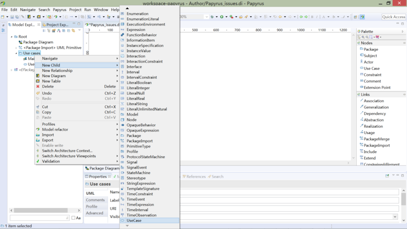
The Lengthy Menu of New Child (right-clicked)
Problem Description
The menu list of New Child is too long to browse through.
For example, every time you want to create a new use case (unfortunately it's at the bottom of the menu) directly in the model explorer (not from in a use case diagram), you have to browse and scroll down the lengthy, complex list by pressing the downward arrow repeatedly, tedious operation.
The same situation happens when creating a new package. You have to scroll down by pressing the arrow many times when the menuitem Package does not appear on the first screen.
Possible Solutions
- Provide a new quick access (shortcuts) panel at the top in the 'New Child' menu for most frequently-created (or primary) items, e.g. Actor, Class, Model, Package and Use Case, etc.
- An alternative way is providing a History panel in the menu to record items most recently created by the user, hence enabling quick access to them by just one click without scrolling.
- Besides the lengthy alphabetical listing, group items into semantical categories to greatly shorten the list, and move those less-created (or secondary) ones into lower-level submenus.
Sequence Diagram
Failed to hide/remove unnecessary guard icons in combined fragments
Problem Description
No any apparent way can be found to hide or remove the guard icons (as shown above, red circled) in combined fragments. Seemingly superfluous, they are not normative, and inconsistent with plain-style drawings (merely simple forms in black and white without any colors or unnecessary decorations).
Possible Solutions
- Could there be a handy project, model and/or diagram level mechanism (by configuration and/or switching) to turn on/off guard icons in all the combined fragments in any relevant diagram?
...

